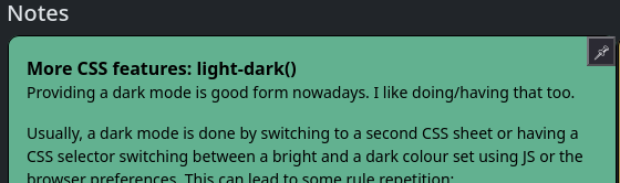
More CSS features: light-dark()

Tags:

Providing a dark mode is good form nowadays. I like doing/having that too.

Light mode

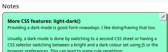
Usually, a dark mode is done by switching to a second CSS sheet or having a CSS selector switching between a bright and a dark colour set using JS or the browser preferences. This can lead to some rule repetition:

.light-theme textarea {
    color: black;
    background-color: #8dfece;
}

.dark-theme textarea {
    color: #62b190;
    background-color: black;
}

Dark mode

CSS also has a function to do this color switching on an element without needing to repeat the declaration in a second rule: light-dark(color1, color2) will return color1 if the light environment is preferred by the user and color2 if the dark environment is preferred.

textarea {
    color: light-dark( black, black );
    background-color: light-dark( #8dfece, #62b190 );
}

You still might want to give the user an option to set their preference only for your website, storing that in a cookie. Bootstrap 5 itself has a fairly thorough, live-switching setup for that, but it's also somewhat long. There also is a short JS snippet on Github which is mildly simpler to integrate, but which only does the switching on page load or toggling of the user selection, and not when the user switches their browsers preference.

Using more CSS for shortening text

Tags:

In the large overview, I don't want to display looong notes:

full_length_note

CSS can cut off content after a given number of lines, and also add an ellipsis:

@supports (-webkit-line-clamp: 10) { overflow: hidden; text-overflow: ellipsis; white-space: initial; display: -webkit-box; -webkit-line-clamp: 10; -webkit-box-orient: vertical; }

... dynamically shortening notes that are too long to 10 lines.

shortened note

Again, CSS might be a far too blunt tool here, but on the other side, this means I don't need to figure out a heuristic to determine whether certain markdown text is longer than 10 lines.

Using CSS to add a feature

Tags:

Yesterday I made a change to my toys, the note taking app that was mostly CSS but still added a lot of functionality.

A note should open when clicking on it, but links within the note should be clickable from the general outside view too. Achieving this was weirdly enough done by using the z-index property of the "inner" links that should be clickable and not open the note itself. Raising these inner links "over" the outer link leading to the single note view was something I had not considered at all when thinking about the problem.

I guess this falls under "interesting how versatile a UI toolkit CSS is", and also, "interesting how overengineered the browser as a UI toolkit is"